Begin with basic forms
Circles, squares, triangles and lines act like a formal alphabet, overlapping and aligning to establish structure first.
Complete free archive
Bauhaus puts art, craft and industry at one table, using geometry, primary color and functional logic to build modern visual order.
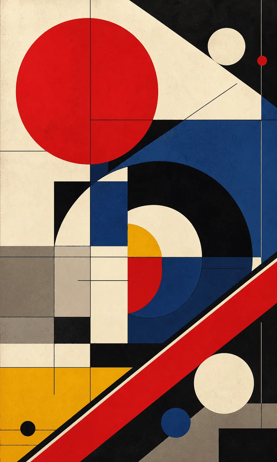
Are the circles, blocks and lines decorating the image, or showing how each part is meant to work?
Circles, squares, triangles and lines act like a formal alphabet, overlapping and aligning to establish structure first.
Red, yellow, blue, black and white often take different jobs: emphasis, division and connection rather than blanket decoration.
Type, furniture and architectural parts keep simple silhouettes, suggesting things that can be made, assembled and used.
These are comparative observation levels, not ratings of artistic value or quality.
Do not reduce Bauhaus to red-yellow-blue. Look for function, structure and visual rhythm working together. Real Bauhaus feels simple, but never casual.
It seeks useful beauty. Geometry is not decoration but a basic language that industry can produce and the public can understand; color often works as structure, not just surface.
Like a modern design classroom built from circles, squares, triangles, red, yellow and blue.
See whether chairs, lamps and shelves reveal how they stand, letting function shape their appearance.
Start with silhouette and color blocks, letting one circular accessory or primary hue carry the emphasis.
Combine stairs, window grids and circular objects, using a frontal view to clarify their relationships.
Notice how boxes, toys and diagrams use simple modules for separation, assembly and recognition.
Shared qualities: Both value function, geometry and modern order.
Different choices: Bauhaus experiments across material, furniture, architecture and graphics; Swiss Style concentrates on grids, type hierarchy and communication.
Shared qualities: Both use basic geometry, sans-serif type and an industrial-age vocabulary.
Different choices: Bauhaus balances form with function; Constructivism pushes diagonals, scale clashes and campaign-like direction.
Bauhaus design poster, circles squares triangles, red yellow blue black white primary palette, functionalist composition, modernist sans-serif typography, clear modular layout, printed paper texture, original exhibition poster, not copying a specific historical work
Avoid excessive ornament, heavy fake aging, complex gradients, cartoonish treatment, direct copy of the Bauhaus building or a specific poster
The Bauhaus school was founded by Walter Gropius in Weimar, Germany in 1919 and later moved to Dessau and Berlin. In the post-World War I context of industrialization and modern living, it connected basic form training, material experiments, architecture, furniture, typography and graphic design.
Do you first sense usefulness and clarity, or the experiment happening through geometry?