 Style Atlas
先理解用途
瑞士风格为什么又叫国际主义字体风格?
Swiss Style 也被称为 International Typographic Style。Cooper Hewitt 对阿明·霍夫曼海报的介绍将它放在瑞士1940至1950年代的设计语境,说明无衬线字、网格、非对称布局与摄影的作用。它重视传播秩序,并不意味着设计必须没有情绪。
想回到具体对象,可看 MoMA 收藏的约瑟夫·米勒-布罗克曼《Der Film》1960年海报记录。再对照苏黎世艺术大学关于其教学的研究,理解构成与教学语境。不要把本页的抽象教学封面误认成他的作品。
从图走向版面
用边界、间隔和重心读秩序
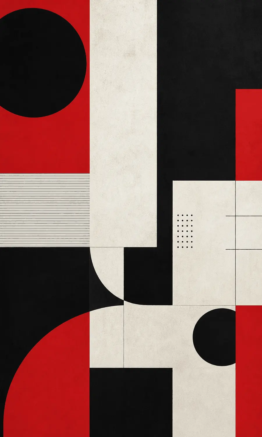
本页封面没有真正的标题与正文,因此不能凭它证明一张海报是否易读。它能帮助你先注意几何关系,再把这些关系用于纸上文字练习。
- 找出跨越不同色块的边界。看中央纸白竖条与上下形状的边缘如何接续。有些对齐线没有被画出来,却能从多个边缘推测;不要把网格理解成必须显示的方格纸。
- 比较大形与小细节的份量。大片红黑先建立视觉重心,小圆点与细线留在较小尺度。若把所有元素做得一样大,画面会失去哪些先后关系?
- 不对称,也可以有平衡。左侧圆形与右侧色块并非镜像。尝试遮住一角,观察重心变化;平衡来自相互作用,不等于左右平均分配。
纸上练习 · 编辑部原创
先让一条消息读得出来
为一场小型讲座写三行信息:主题、时间、地点。先选主题作为入口,把其余信息降为两个次级层次。在纸上轻画三列参考线,尝试让不同文字共用一个左边缘;参考线最后可以擦掉。
接着只用黑白排一版,再在确有需要的地方加入一个强调色。把纸拿远,问自己“先看到什么,接下来能不能找到时间?”如果读者仍要猜,不要急着换字体,先改字级、间隔与分组。
这不是要求所有海报变得极简。密集信息也可以有秩序,安静版面也可能让人不知所措。你在检验阅读路径,而不是用一套外观给作品打分。完成后可用视觉层级检查清单再看一遍。
相近不等于相同
瑞士风格、包豪斯与琳派怎么比较?
包豪斯可以帮助你继续观察基础形与构成,但两者不是同一个历史标签。想练习字与图如何分层,可打开编辑排版风格简介;具体完整档案的访问范围以图鉴标识为准。
再读琳派,比较空白怎样服务不同任务:这里的版面练习让读者找到消息,琳派文章则从花叶之间的间隔看装饰节奏。相同的“留白”一词,不代表相同的材料、历史或目的。
关于瑞士风格的三个问题
选无衬线字体就够了吗?
不够。单一字体不能替你安排内容层级、阅读顺序和信息分组。
网格是不是会让版面僵硬?
网格是一种组织关系,不必全都画出来,也不要求每一格填满。应该根据消息与阅读需求使用它。
瑞士风格完整档案免费吗?
是。它属于图鉴已开放的20篇免费完整档案,包含学习模块。其余付费档案、无限收藏与高清无水印等 Plus 权益,不因阅读本文而自动解锁。
Swiss Style: make structure serve the message
Swiss Style, also known as the International Typographic Style, organizes information through relationships among type, images and space. If you are preparing a poster or an event card, the useful starting point is its message. Red and black, or a particular sans-serif typeface, cannot organize that message on their own.
Cooper Hewitt's account of Armin Hofmann places the movement in Switzerland in the 1940s and 1950s and discusses typography, grids, asymmetry and photography. The example also makes room for expressive energy: order need not mean an absence of feeling.
For a historical object, see Josef Müller-Brockmann's Der Film, dated 1960, in MoMA's collection. A Zurich University of the Arts study of his teaching offers further context. The geometric cover here is our digital teaching illustration, not a work by either designer.
Notice alignment before naming the style
Our image contains no real headline or body text. It therefore cannot demonstrate whether an actual poster is readable. It can help you begin with boundaries and scale before applying those relationships to words on a page.
Look for edges that appear to continue across different colored areas. Some organizing lines are implied rather than drawn. A grid can coordinate unrelated items without remaining visible in the finished composition, and it does not require every space to be filled.
Compare the large areas with the small dots and thin lines. The difference in scale creates a possible order of attention. Then compare the circle on the left with the weight on the right: they are not mirror images. Cover one corner and consider what changes. This is an observation exercise, not a rule that every Swiss poster must share the same shapes.
Try an information-first poster exercise
Write the topic, time and location for a small talk. Choose the topic as the main entry point and make the remaining information visibly secondary. Sketch three faint columns and try sharing one left edge across different text groups. Erase the construction lines when they have done their job.
Work in black and white first. Introduce one accent color only when it has a role. Hold the sheet farther away and ask what you see first, then whether you can find the time without searching. If the route is unclear, change size, spacing or grouping before trying another typeface.
The exercise does not demand minimalism. A dense poster can communicate clearly, while a quiet layout can leave the reader uncertain. Test the reading path, not how fashionable the surface appears. Our visual hierarchy checklist can help you review the result without pretending to judge artistic quality.
Compare related questions with care
Bauhaus is another useful starting point for basic forms, but it is not an interchangeable historical label. The Editorial Typography introduction offers a related question about the relationship between text and image; check the atlas's labels for complete-archive access.
Our Rinpa article asks how intervals connect plants and decorative movement. In the poster exercise, intervals help readers locate information. The same word, space, can serve different tasks without making the traditions equivalent.
Is a sans-serif typeface enough?
No. A typeface choice does not decide the hierarchy, grouping or order of information for you.
Does a grid have to look rigid?
No. Use it to coordinate relationships, not to fill identical boxes. The communication task still leads.
Can I read the complete Swiss Style guide free?
Yes. Swiss Style is one of the atlas's twenty free complete archives. Other paid archives, unlimited favorites and HD watermark-free export still follow the existing Plus access rules.
Sources · 资料与延伸阅读
把风格判断放回具体设计
- Cooper Hewitt, Smithsonian Design Museum — A Harmony of Contrasts:阿明·霍夫曼与瑞士风格语境。
- MoMA — Josef Müller-Brockmann, Der Film, 1960:独立历史作品记录。
- Zurich University of the Arts — The teaching of Josef Müller-Brockmann:教学研究入口。
资料核实于 2026-10-21。本文示意图观察与纸上任务由 WonderElian Editorial 原创;没有展示或复制机构作品图片,不代表机构背书。