First, notice the grid
Headline, image, numbers and empty space feel attached to one coordinate system: different positions, one coherent order.
Complete free archive
Swiss Style turns information into a precise visual system with grids, sans-serif type and disciplined whitespace, ideal for tech, events, brand launches and rational posters.
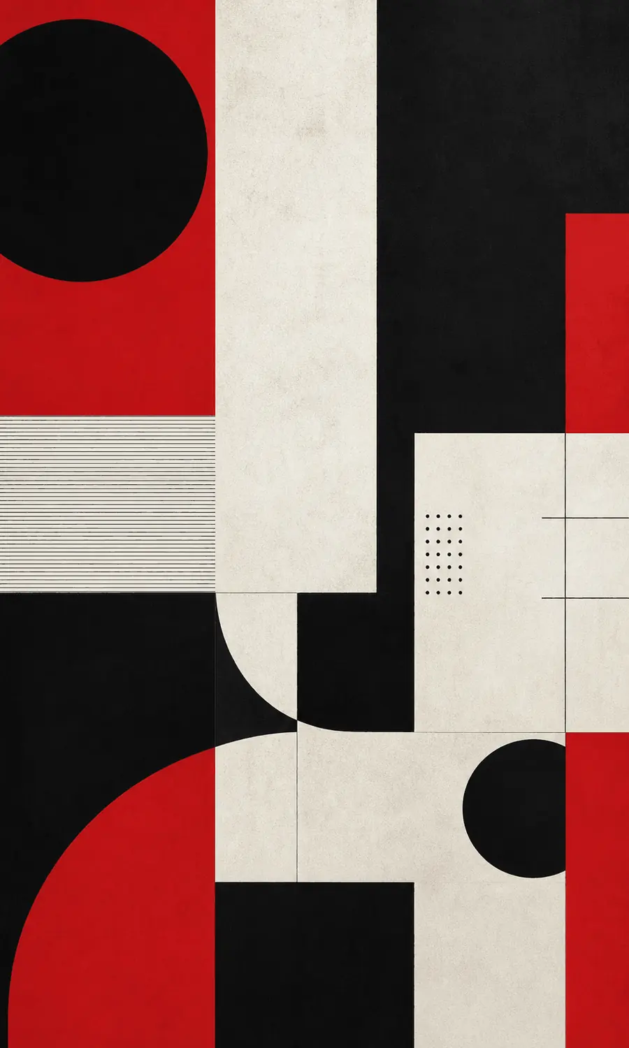
Before reading the words, notice whether an invisible line has already led your eye to what matters most.
Headline, image, numbers and empty space feel attached to one coordinate system: different positions, one coherent order.
Blank space is not unfinished; it separates information, creates breathing room and makes priorities visible sooner.
Color and type deliberately step back, leaving attention to the content and creating an exact, restrained mood.
These are comparative observation levels, not ratings of artistic value or quality.
When viewing Swiss Style, look for the grid first: headline, image, numbers and blank space feel locked to one coordinate system. Its premium tone comes from precision, not decoration.
It looks cool-headed because the designer steps back and lets content speak. The grid decides placement, type size decides hierarchy, and whitespace gives the message air.
Like a news poster calibrated by an invisible grid: calm, exact and free of wasted gestures.
Notice aligned furniture edges and open pathways; a few objects can still form a clear hierarchy.
Limit the palette to two or three colors and let silhouette, proportion and spacing replace decoration.
Place the subject off-center, then use architecture or background edges to guide the eye back.
Look at how transit signs, medicine packaging and manuals use type size and space to establish order.
Shared qualities: Both pursue modernity, clarity and function.
Different choices: Swiss Style focuses on communication, grids and type hierarchy; Bauhaus gives more weight to materials, basic geometry and formal experiment.
Shared qualities: Both organize reading through type and layout.
Different choices: Swiss Style usually keeps the system neutral and stable; editorial typography lets headline scale, image-text balance and rhythm shift with the story.
Swiss International Typographic Style brand launch poster, strict mathematical grid, flush-left sans-serif headline, objective photography or geometric form, restrained black white red palette, strong whitespace, clear information hierarchy, premium print texture, original modern design, not copying any specific poster
Avoid cluttered decoration, script fonts, cheap gradients, random centered layout, low-quality text, copying a specific designer poster composition
It matured in mid-20th-century Swiss graphic design, drawing from Bauhaus, Constructivism and modernist typography. Postwar communication, corporate identity and public information needed clarity, so grids, sans-serif faces such as Helvetica or Univers, flush-left type and objective photography became central tools.
Do you enjoy its order, or does it feel a little too restrained?