Begin with the empty field
Empty space occupies most of the field, giving one object, line or plane greater weight and slowing the act of looking.
Complete free archive
Minimalism reduces the image to the fewest elements: limited color, form and narrative, using proportion, space and material presence to create quiet force.
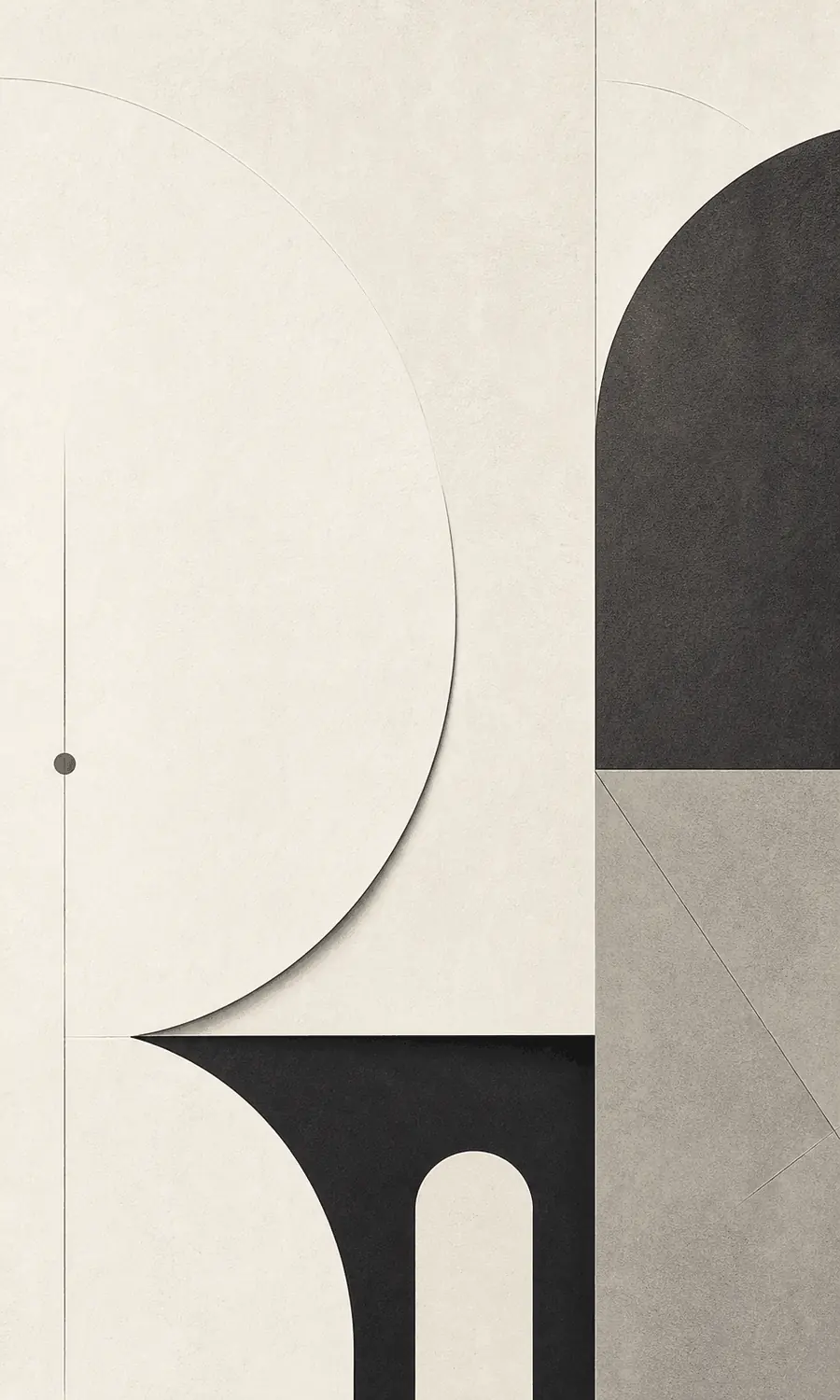
After so much has been removed, what controls your attention: proportion, material or empty space?
Empty space occupies most of the field, giving one object, line or plane greater weight and slowing the act of looking.
Subtle width, distance and alignment replace complex content; moving one element slightly can change the whole balance.
When pattern and narrative recede, the edge, texture and light of paper, metal, wood or pure color become the content.
These are comparative observation levels, not ratings of artistic value or quality.
Do not ask first what is depicted; ask what remains. True minimalism is not empty. Everything left has to be exact.
Its logic is to remove until nothing more can go; then the remaining relationships become visible. A square, a line or a blank field must carry position and weight.
Like a room with only one chair and one beam of light, where emptiness becomes the subject.
Observe the proportion between one piece of furniture, the wall, floor and pathway, letting unfilled areas do work.
Build emphasis through clear silhouette, one material contrast and a limited palette, watching garment-to-body proportion.
Let the subject occupy little of the frame and check whether every edge supports it instead of treating emptiness casually.
See how packaging, tableware and interfaces reduce controls and marks while keeping purpose immediately legible.
Shared qualities: Both value space, clear hierarchy and restrained form.
Different choices: Swiss Style still serves information, grids and reading efficiency; Minimalism can make object, material and proportion the main subject.
Shared qualities: Both use clear silhouettes and exact proportion.
Different choices: Minimalism lets absence and space lead; Art Deco builds grandeur through repetition, sheen and geometric ornament.
Minimalist visual poster, vast negative space, single geometric form, low-saturation neutral palette, precise proportion, quiet premium mood, minimal text, paper or metal material feel, original brand poster, not copying a specific minimalist artwork
Avoid decorative patterns, complex scenes, loud gradients, cluttered text, fake luxury mockup look, direct copy of an art installation
Minimalism became a major tendency in 1960s American art, associated with Donald Judd, Sol LeWitt, Agnes Martin and others. It resisted highly personal expressive brushwork and turned toward industrial material, repetition, basic geometry and the viewer's space.
Does this reduction sharpen your attention, or leave too little detail to stay with?